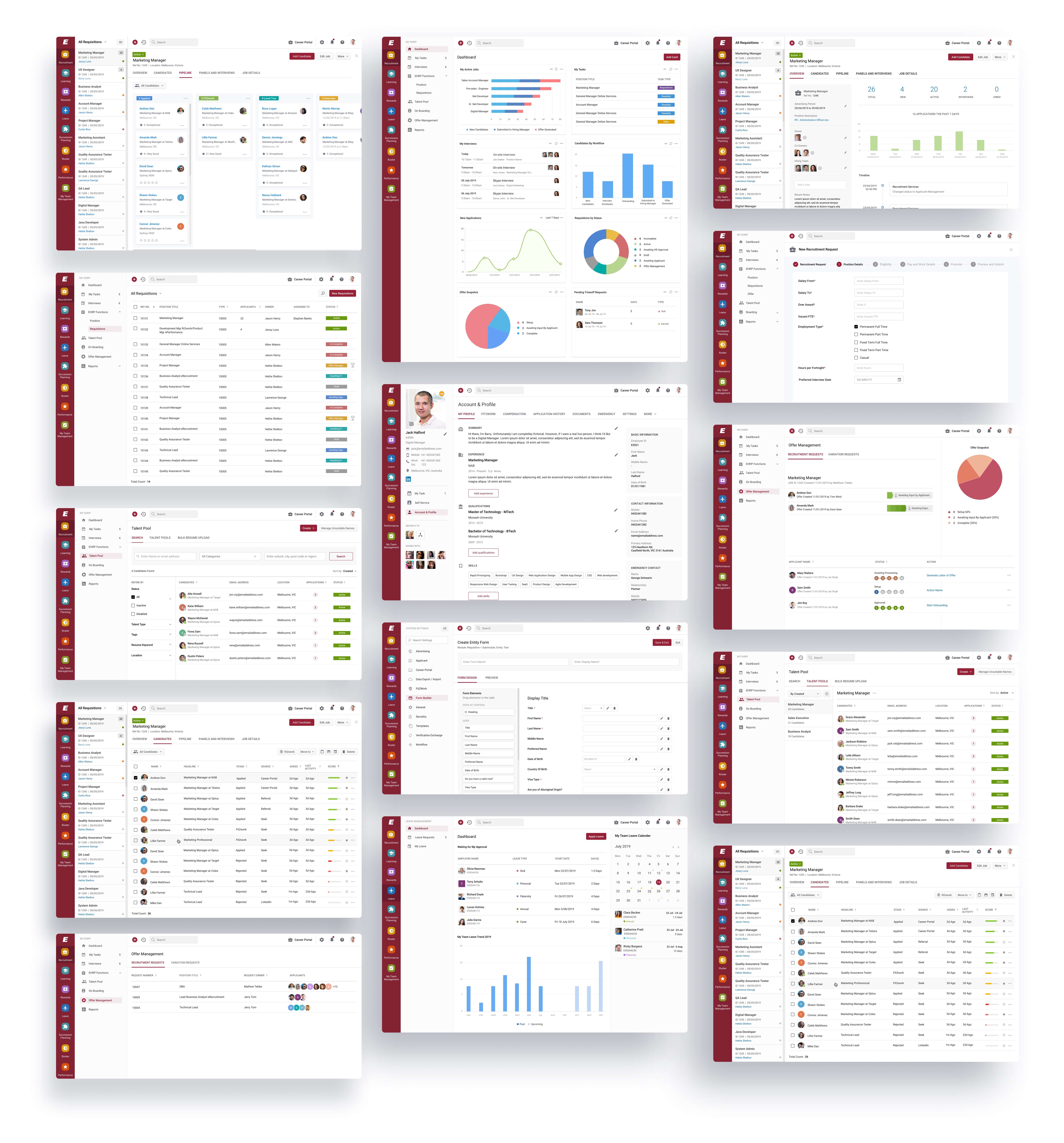
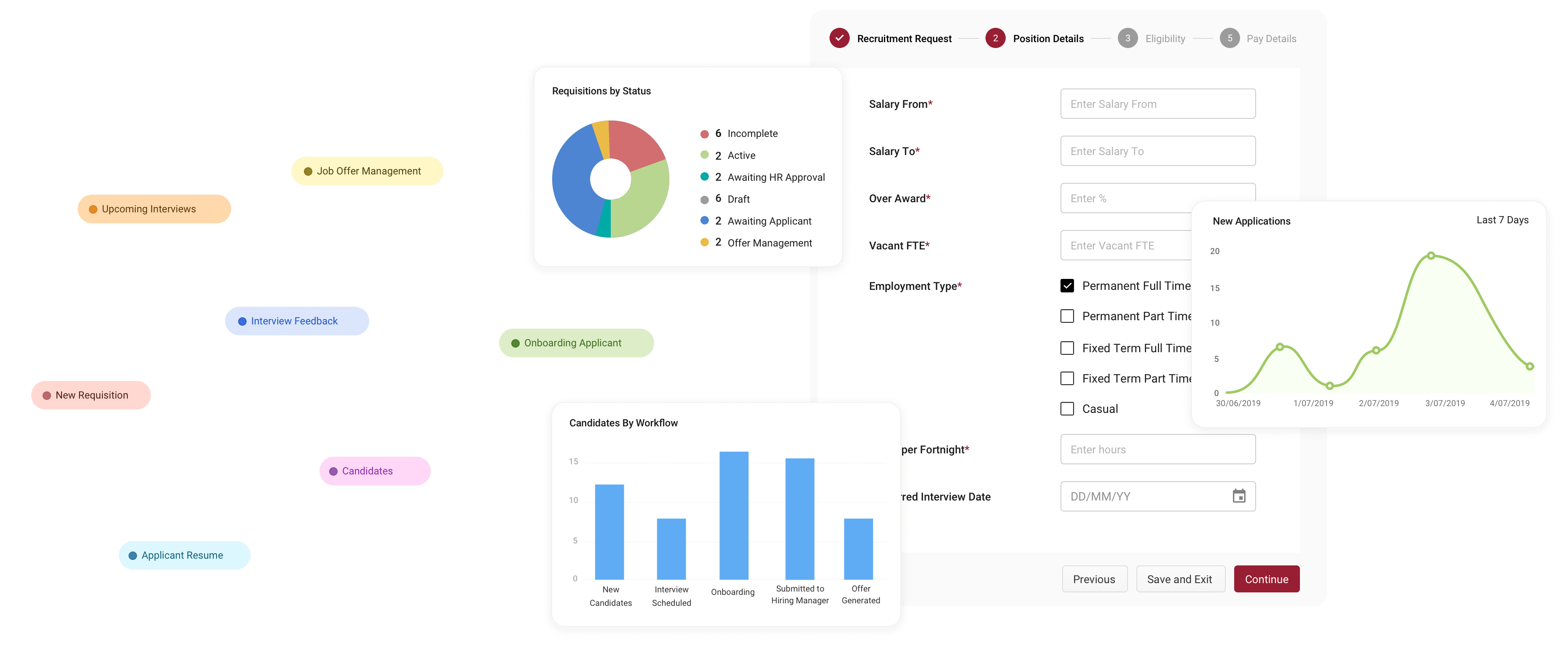
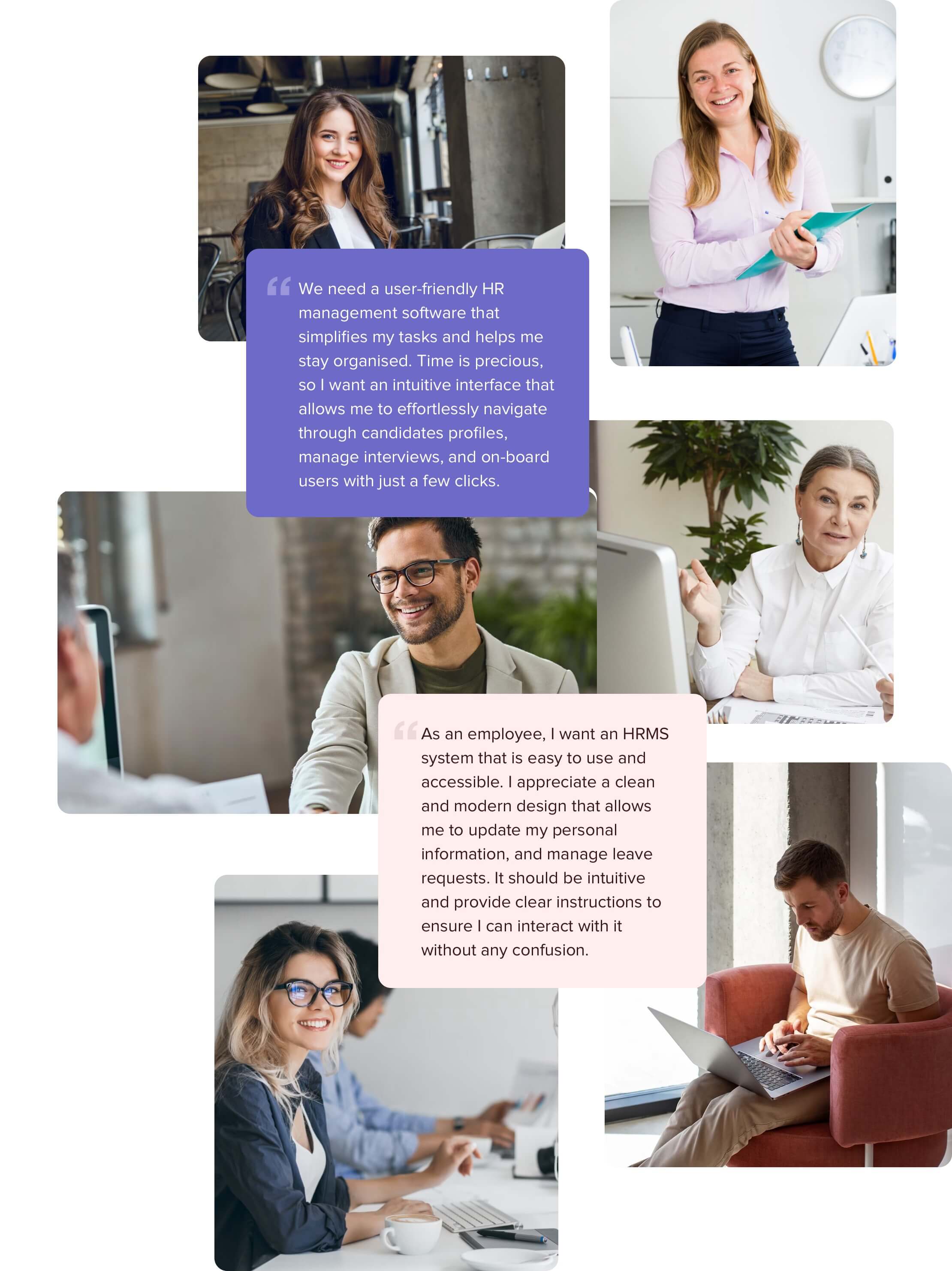
It's crucial to comprehend users' needs to develop a digital product that people will enjoy using. Collaborated with the client to know user pain points and expectations. We conducted user research to understand the pain points, needs, and performed heuristics audit on existing platforms. We used a combination of interviews, surveys, and user testing to gather insights.
Based on our research, we identified the following key user needs:
Persona Building
User interviews
Heuristic Evalution
User Jorney Mapping
Information Architecture
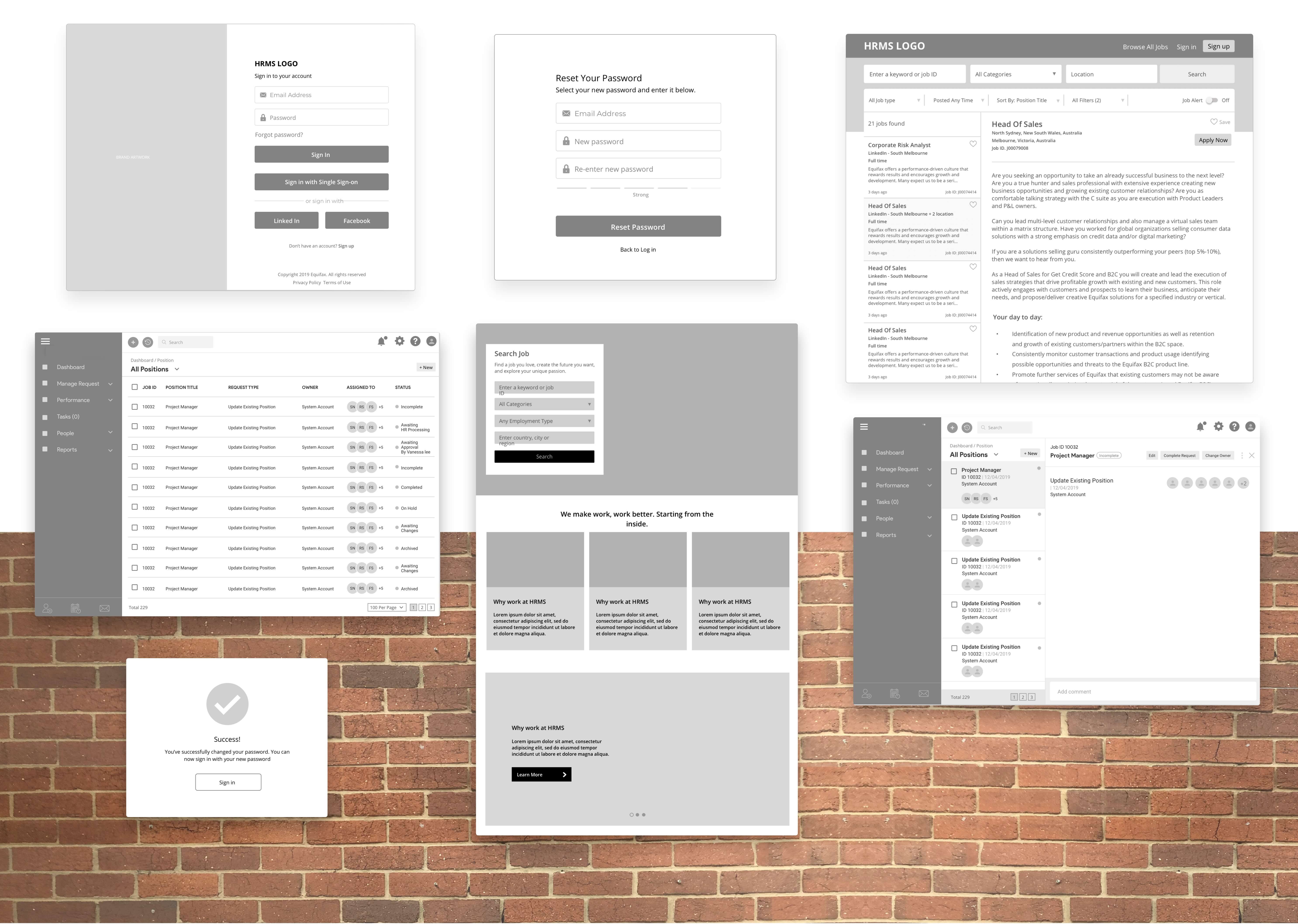
Wireframing
Hi-fidelity Mockups
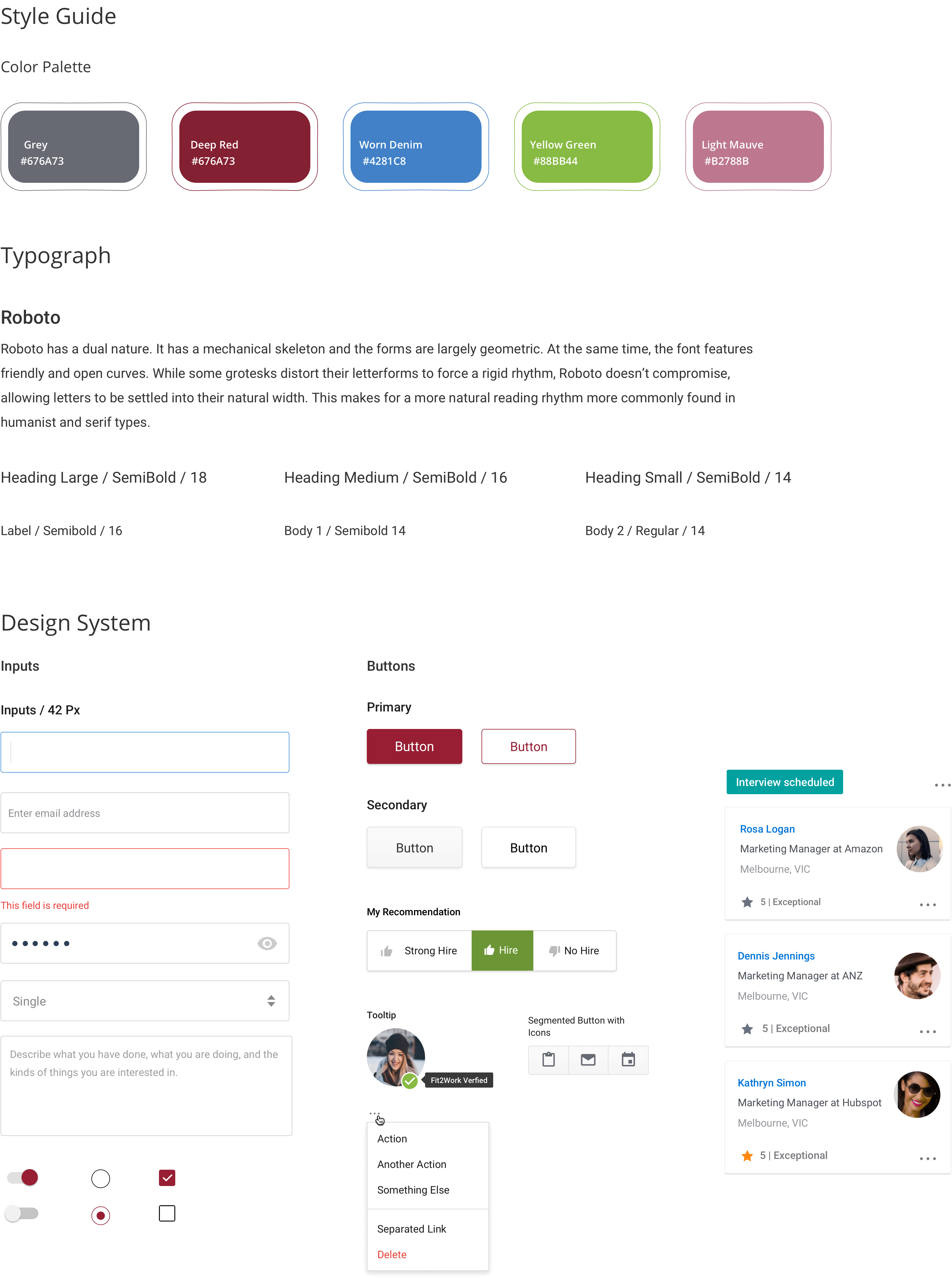
UI Components
Hi-fidelity Mockups
Visual Design
Style Guide
Clarity
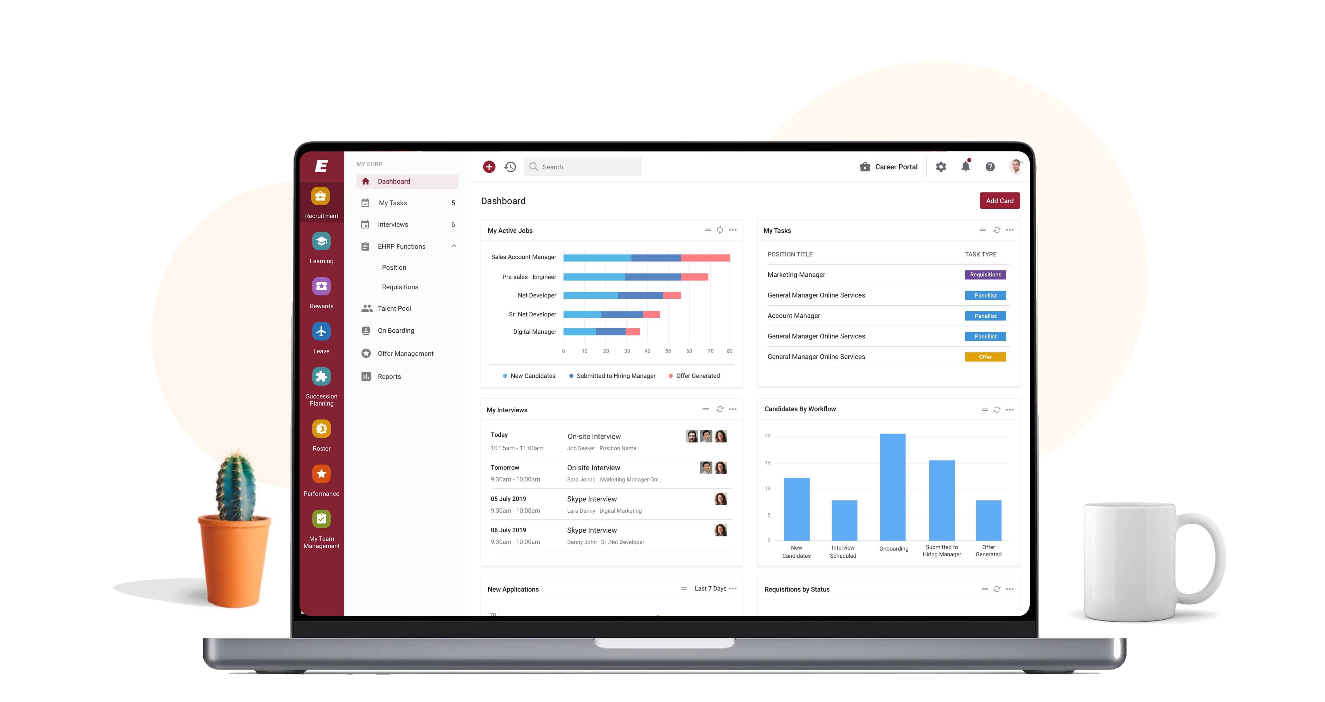
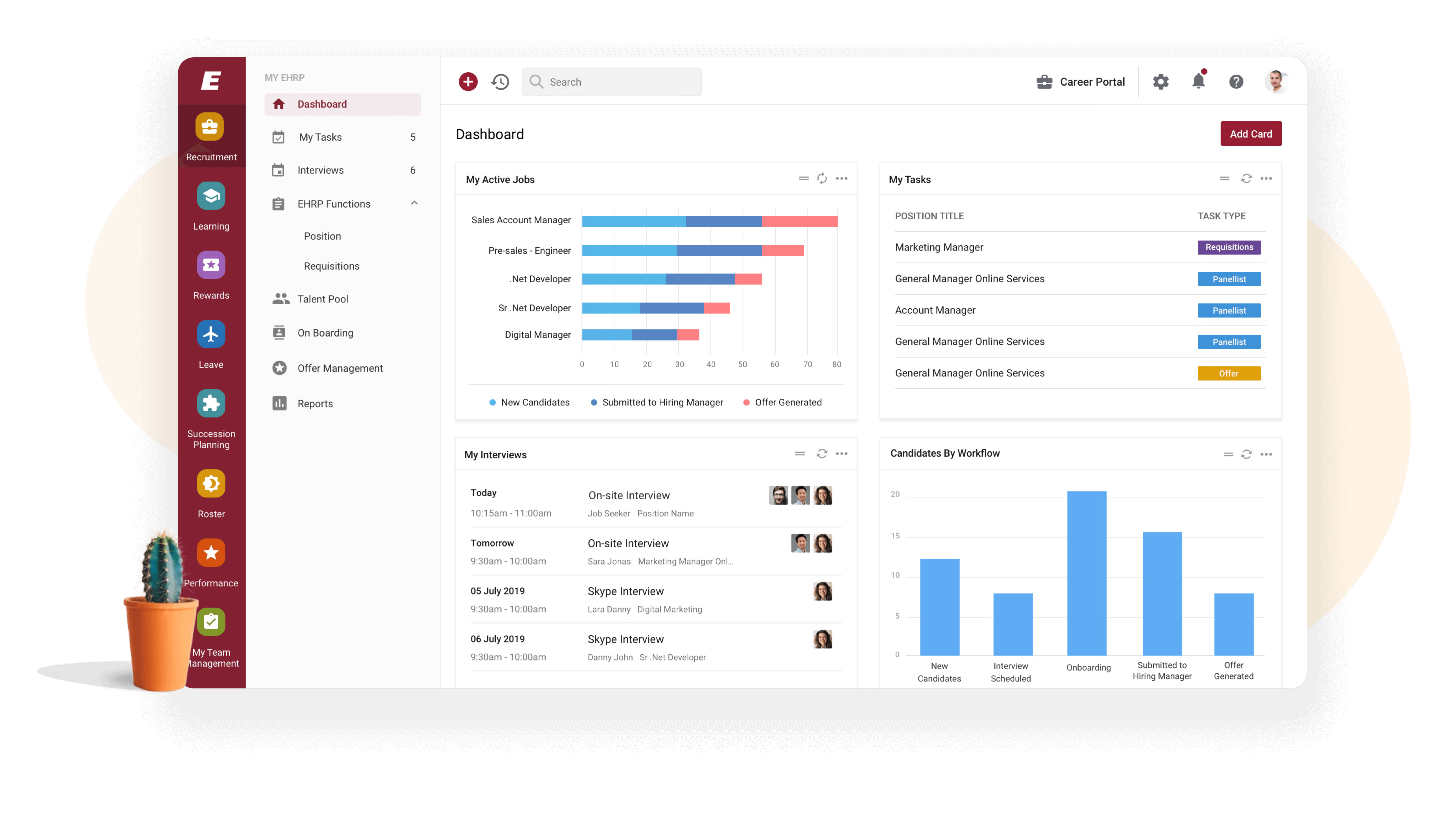
The user interface was designed to be clear and easy to understand. We used clear and concise language, icons, and colors to guide the user through the application.
Consistency
We ensured that the application was consistent across all screens and modules. This helped to reduce cognitive load and increase efficiency.
User-centered
The design was based on user needs and behaviors. We made sure that the application was user-friendly and met the needs of the target users.
Visual hierarchy
We used visual hierarchy to highlight important information and guide the user's attention to the most relevant parts of the application.


