Easyy Mobile App

Role: User Experience, Visual Design, Responsive Web Design

Easyy App

OVERVIEW

Easyy makes it easy to order and pickup coffee, food & drinks

Easyy is a simple and beautiful app that allows users to place an order and pay ahead. That means user can walk in and without waiting in line, ask a barista for your freshly made order at the pickup area. No hassle, no cash, no waiting.
Research

The Problem

After market research and competitors analysis we found that there are few similar mobile apps, that provide the same functionality, but they all offer very complex and in-depth solution.

The client's main idea was to create a simple app that would stand out and allow users to browse coffee shop menu and place order.

The Challenge

The first challenge was to create a user experience that will be simple, effective and only provides informations that user would need

The second challenge was to work through the low budget that was available.

Research

We tried to stay focused through the research, by making it short and effective. We gathered as much data as possible from user interviews, brainstorming, etc

We started to ask questions:

  • who are the users we are targeting,
  • which features would be useful to them,
  • what goals do they need to accomplish
  • and what are the users needs and desires

Personas

Creating personas helped me to create empathy and understanding of people I am designing for.
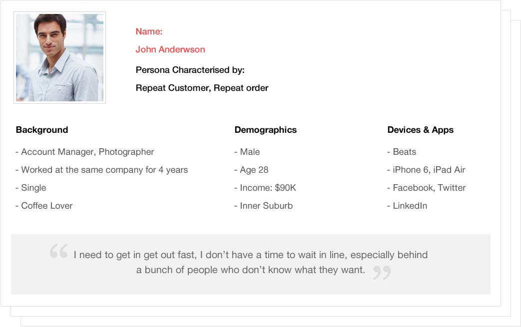
Personas

User Task Flow

Task flows helped us to think through the design, before a feature is actually developed. It helped us to interject the user into the flow of the application, and determine if the conceptual model agrees with the user model.
Userflow
Checkout Process Flow

Sketches and Wireframes

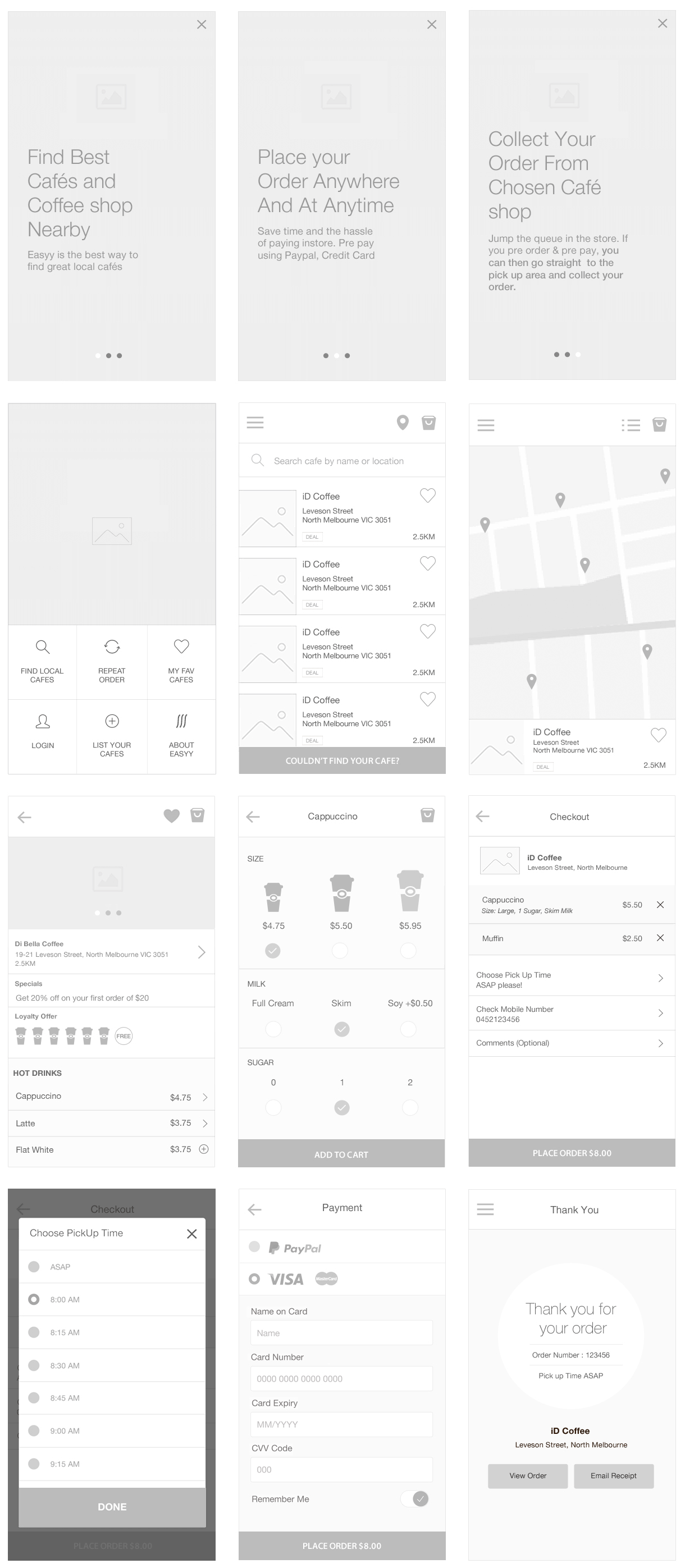
I always start any project by sketching first; quick wireframe sketching allows to painlessly seeing changes and alternative solutions almost immediately. After the main features were worked out on paper, I made wireframes.
Easyy App Wireframe

Testing and Improvements

After our wireframes were created, we decided to do some first one-to-one interviews in which users would be asked to perform a series of tasks. Through the interview we asked our users to perform specific task; like find nearby cafe, edit profile, add to cart, save credit card, check out, reset password etc.

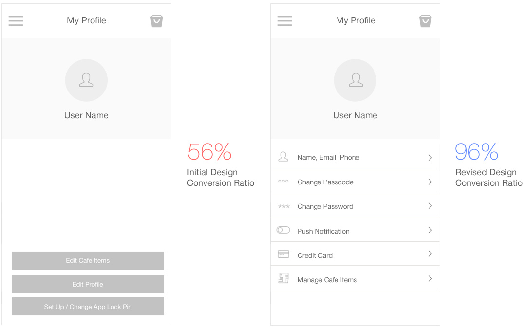
By watching our test users use our product we found that there is still room for improvements and that there were a lot of areas that were confusing and not simple or clear enough. We updated our wireframes and invited potential users to a second interaction.
A/B Testing

Visual Design

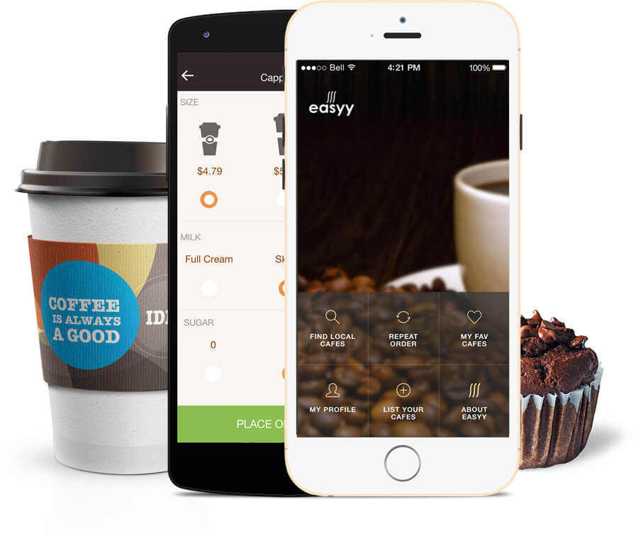
After all the wireframes were designed I moved onto styling the user interface of the app. I focused on designing an interface that was simple, clean and beautiful.
App Design
Responsive Web Design

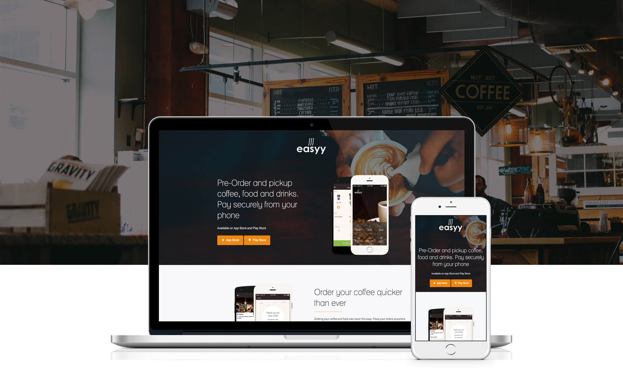
Responsive App Landing page

I designed a simple responsive landing page for the app. Again, my goal was to keep the visual style consistent across the app and promotional material.
Download Easyy from the App Store, Google Play or visit www.easyy.co

Have a project to discuss? Let's talk!

I'm a freelance UX UI Designer based in Melbourne. I offer a range of high quality design services include UX, UI, Web Design, Mobile App design, eCommerce and Web application design. I've worked on a diverse mix of large and small design projects.

The easiest way to get in touch is to email me if you feel the personal touch is needed then just give me a call. I look forward to hearing about your brief.
Brands

senthil.nm@me.com

Mobile +61 452 441 382